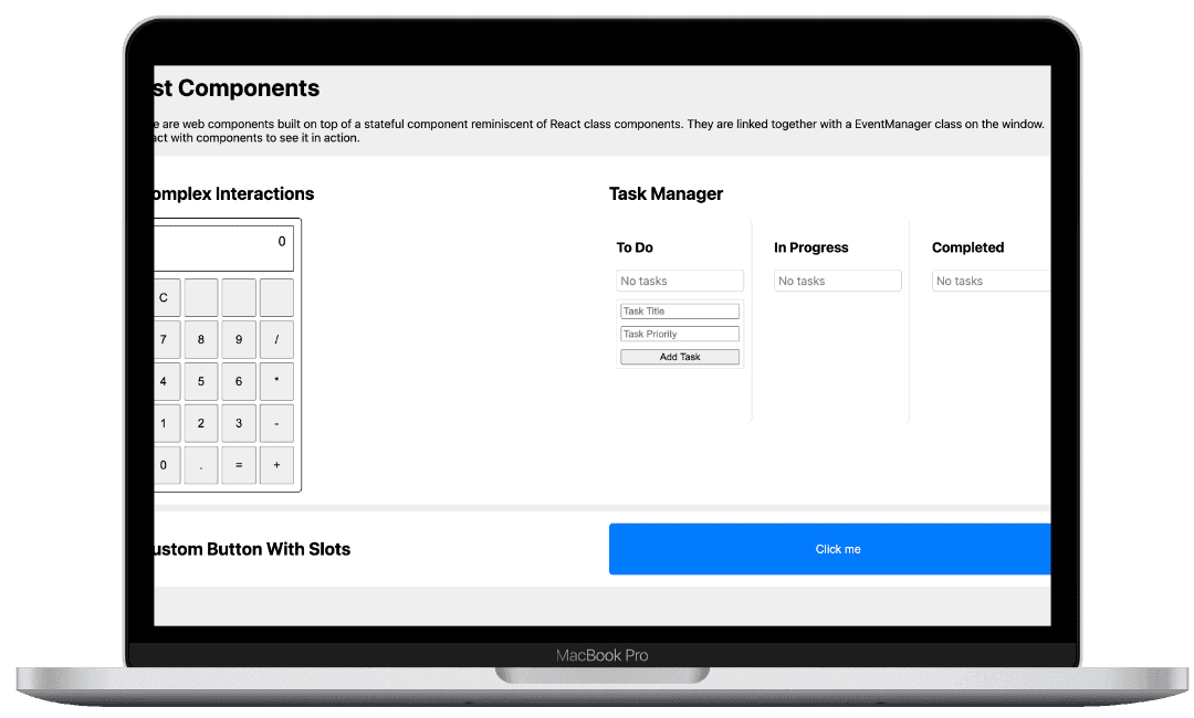
Web Component UI Library
Wed Sep 25 2024
Building a Custom Web Component UI Library: The Power of Native Web Technologies
In my quest to build a versatile, cross-platform UI component library, I stumbled into the world of Web Components. While I’ve built many tools using frameworks like React and Vue, this time I wanted something more flexible, something that could easily plug into any environment—from WordPress to a custom React application—without much overhead. Enter Web Components.
This post is about my journey building a custom component library using native browser technologies. Along the way, I inadvertently recreated some familiar patterns, like React's class components, and discovered the real power of native Web Components. Here’s a deep dive into what I built, why I built it, and how you can leverage similar tools in your own projects.
What Are Web Components?
At their core, Web Components are a set of APIs that let you create reusable, encapsulated HTML elements. Unlike traditional front-end frameworks, Web Components run natively in the browser, which means they don’t require extra libraries or frameworks.
There are three key technologies behind Web Components:
- Custom Elements: Define your own HTML tags with custom functionality.
- Shadow DOM: Encapsulates the element’s styles and behavior, preventing external CSS or JS from affecting it.
- HTML Templates: (Optional) Allows for reusable HTML structures, though I didn’t use it in this project since it didn’t offer any performance or developer experience benefits in my use case.
For a more in-depth overview, you can check out MDN’s Web Components guide.
The Problem I Set Out to Solve
This library was born out of a practical need: I wanted a flexible, reusable UI component library that could work seamlessly across different platforms—whether the client was using WordPress, a custom CMS, or a React-based application. The components needed to be lightweight, modular, and highly configurable.
I also wanted to avoid re-inventing the wheel with every new project or client request. Web Components, with their native encapsulation and reusability, were a perfect fit for this scenario.
Web Component Lifecycle: A Familiar Friend
If you’re used to React or Vue, Web Components might feel surprisingly familiar. They come with their own lifecycle methods, much like React’s componentDidMount, componentDidUpdate, and componentWillUnmount.
Here’s a quick comparison:
| Web Component Callback | React Equivalent | Description |
| -------------------------- | ---------------------- | --------------------------------------------------------------------------- |
| connectedCallback | componentDidMount | Runs when the element is added to the DOM—great for initial setup. |
| disconnectedCallback | componentWillUnmount | Runs when the element is removed—useful for cleanup. |
| attributeChangedCallback | componentDidUpdate | Fires when observed attributes change—ideal for responding to prop changes. |
These lifecycle methods allow you to manage state, re-render the component, and handle clean-up in a manner very similar to how you would in React. But unlike React, there’s no virtual DOM here—Web Components manage their own rendering.
Example: connectedCallback
connectedCallback() {
  // Set up initial state, listeners, or make API calls here
  this.render();
}
Example: attributeChangedCallback
attributeChangedCallback(name, oldValue, newValue) {
  if (oldValue !== newValue) {
    this.render();
  }
}
Creating State with Web Components
One of the main challenges I faced was managing state within my custom elements. Web Components don’t have a built-in state management system like React’s useState or Vue’s data. To handle this, I created a simple state system within each component that manages internal data and re-renders the component when necessary.
A Simple setState Example
Here’s how state management works in the components:
setState(newState) {
  this.state = { ...this.state, ...newState };
  this.render();
}
This method allows the component to update its internal state and automatically trigger a re-render whenever that state changes.
Styling with Shadow DOM
The Shadow DOM is one of the coolest parts of Web Components. It allows you to encapsulate the styles and logic of each component, so your styles don’t leak out to the rest of the page—and external styles won’t affect your component.
Here’s how I used the Shadow DOM in the project:
class MyComponent extends HTMLElement {
  constructor() {
    super();
    this.attachShadow({ mode: 'open' });
  }

  render() {
    this.shadowRoot.innerHTML = `
      <style>
        /* Scoped styles live here */
        .my-component {
          background: blue;
          color: white;
        }
      </style>
      <div class="my-component">
        Hello from the Shadow DOM!
      </div>
    `;
  }
}
With this setup, the component is fully encapsulated—none of its styles will bleed into the global scope, and it remains completely self-contained.
Handling External Data with Web Components
One of the key features I needed was the ability to handle external data. Whether it’s updating live scores or rendering promotional content dynamically, Web Components allowed me to seamlessly integrate support. Here’s a simple example:
async connectedCallback() {
  data = await fetchData(this.dataId)

  this.setState({ data })
}
This simple strategy of fetching on connected allows us fetch data before the content is rendered. Alternatively we can move this to a later stage or have a deferred attribute to defer the fetch.
Key Lessons Learned
- Modularity: Web Components provide a fantastic way to build modular, reusable UI elements that can work anywhere.
- Performance: Unlike frameworks that require bundling and transpilation, Web Components are natively supported in modern browsers, meaning no additional libraries are needed, which can help with performance.
- Familiar Patterns: Despite working outside of a framework, I found myself naturally recreating many patterns from React and Vue, which shows how universal these patterns have become.
Final Thoughts
Building this Web Component UI library was an eye-opening experience. It reinforced my belief in the power of native browser technologies and the flexibility they offer. While frameworks like React and Vue are fantastic for most use cases, Web Components shine when you need something lightweight, encapsulated, and reusable across many different platforms.
If you’re curious to explore more, check out the GitHub repository, and feel free to fork the project or contribute!
Happy coding!