CSS Design Examples
Thu Nov 18 2021
Live DemoCSS Design Examples
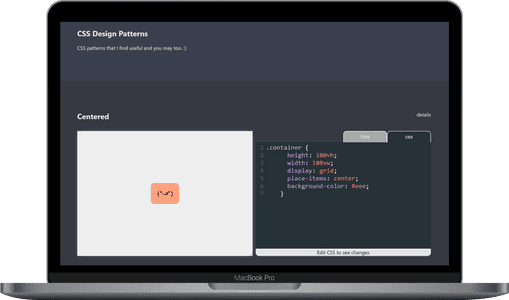
When you're learning CSS, it’s easy to find yourself repeatedly searching for the same snippets—whether it’s a grid layout, a flexbox trick, or a responsive design pattern. I built the CSS Design Examples site to provide a handy, interactive reference for myself and others. This site contains some of the most useful CSS layouts and patterns I've come across, all in one place. Whether you're working on a simple layout or experimenting with more advanced designs, you’ll find real, working examples with interactive code.
The site is powered by ReactJS and features a CodePen-like interface, allowing users to see both the code and its result in real time. This interactivity makes it easy to tweak the examples and learn by doing.
Why I Built It
Throughout my journey learning CSS, I found that I often needed to revisit the same design patterns. Searching for the same solutions repeatedly wasn’t efficient, so I decided to gather the examples I found most useful into a single resource. Now, instead of hunting for snippets or revisiting the same tutorials, I have a personal library of CSS patterns that I can reference anytime—and you can too!
Key Features
-
Interactive Editor: The site features an editor where you can tweak the CSS and HTML for each example and see the results instantly. This makes it a valuable tool for learning and experimentation.
-
Flexbox and Grid Layouts: Some of the most common challenges in CSS revolve around layout. I’ve included a variety of Flexbox and CSS Grid examples that cover everything from basic setups to more advanced, responsive layouts.
-
Specialty CSS Designs: Beyond layout, the site also features some specialty CSS designs like hover effects, animations, and creative use of pseudo-elements for enhanced styling.
-
Responsive Design: All of the examples are designed with responsiveness in mind, ensuring that they work across a variety of screen sizes.
Example Snippets
Here are a few types of examples you'll find on the site:
-
Centered Flexbox Layout: A simple way to center content both horizontally and vertically using Flexbox.
-
Grid-Based Layout: A CSS Grid example showing how to create a responsive layout with multiple columns and rows.
-
Responsive Card Design: A flexible card layout that adjusts to the screen size, perfect for dashboards or content-heavy sites.
Tech Stack
- ReactJS: The entire site is built using React, providing a fast and interactive experience for users.
- HTML & CSS: The heart of the project is, of course, the CSS and HTML examples, which are easily accessible and editable within the interactive editor.
Final Thoughts
CSS Design Examples is a resource for anyone looking to improve their CSS skills. Whether you’re just starting out or you’re an experienced developer, this site offers a place to explore different patterns and layouts, all with live, editable code.
Feel free to check out the GitHub repository to see the source code, or try out the live demo to explore the interactive examples!
Happy coding!